Selected directions
Some of what’s possible.
Not templates. Not a prescribed look.
These are a few ways a digital storefront can be shaped around the thing that matters most: the product, the people behind it, and what makes the brand worth caring about.
Build a world worth
waking up for.
PEP turns a morning staple into something bright, characterful, and unmistakably its own. The digital experience carries that energy through every screen.
a point of view.
A distinct palette, expressive art direction, and clear commerce come together as one recognizable world.
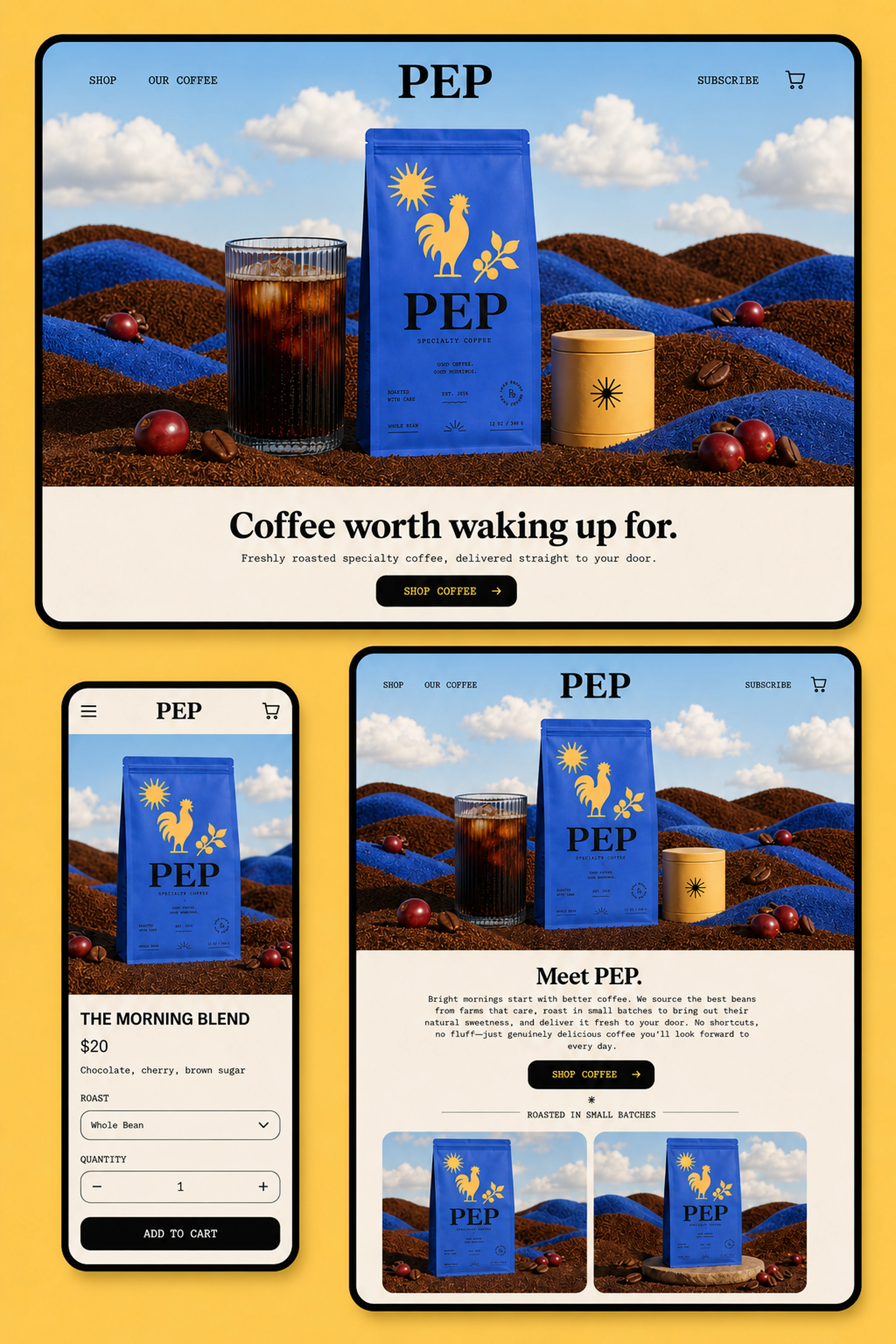
One visual language.
Every screen.
Let the system
show the range.
Morrow’s identity is direct, modern, and product-first. A modular experience gives every flavor its moment while keeping the full family immediately recognizable.
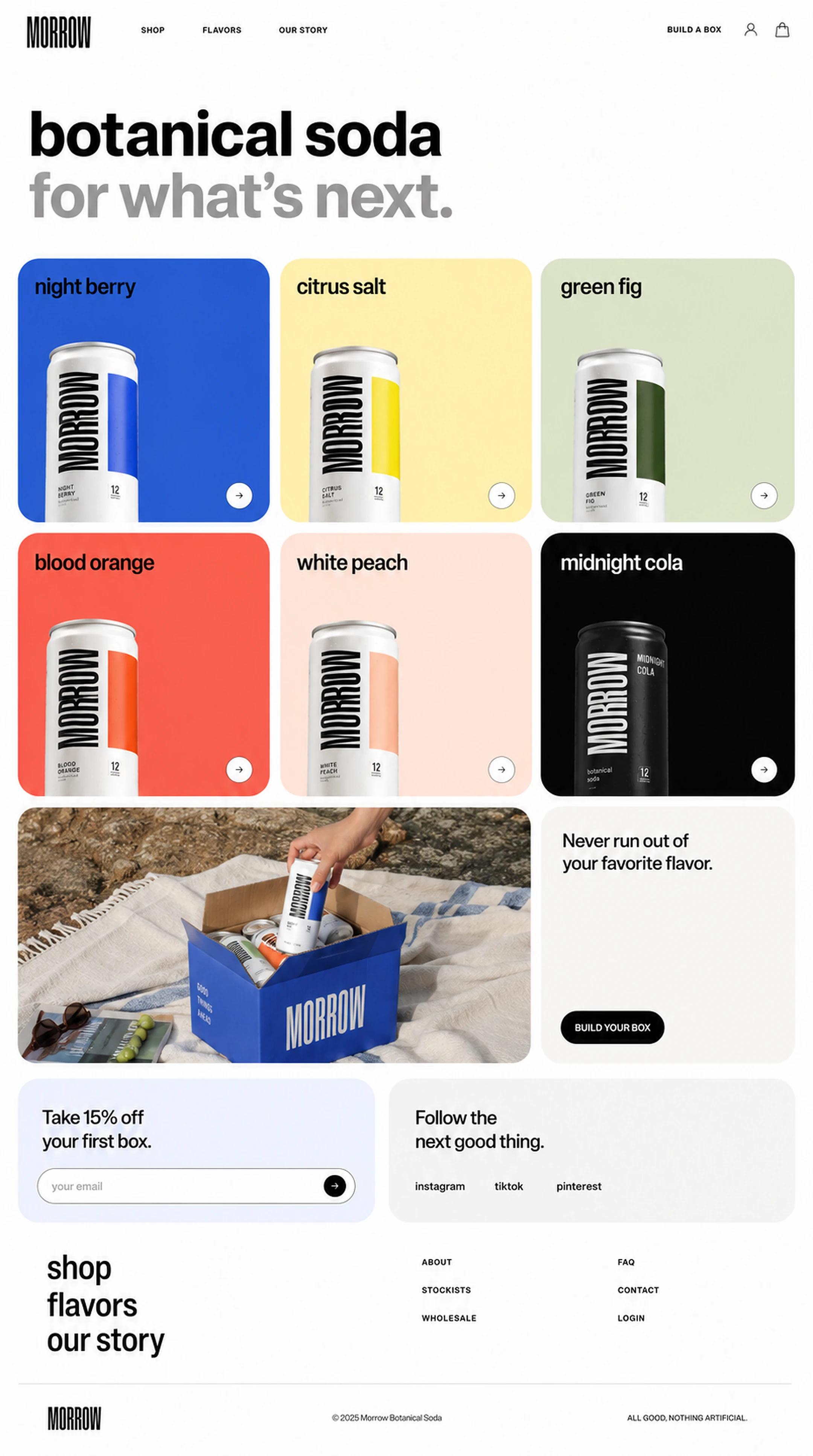
One clear voice.
Product discovery, brand story, subscriptions, and social touchpoints all belong to the same visual rhythm.
→The common thread
The right experience shouldn’t make your brand look like everyone else. It should make it feel more like itself.
We pay attention to what is already there—the character of the product, the details customers notice, and the ambition behind the business—then build from that.
If something here sparked an idea, we’d be glad to hear it. ↗